My final product page design on Android and iOS
NORDSTROM APP PRODUCT PAGE
In preparation for a new store service coming to the Nordstrom App, Reserve & Try in Store, I redesigned the apps' product pages to scale beyond the single Buy Online & Pick Up in Store service in the original design.
Platforms: Android, iOS (iPhone/iPad)

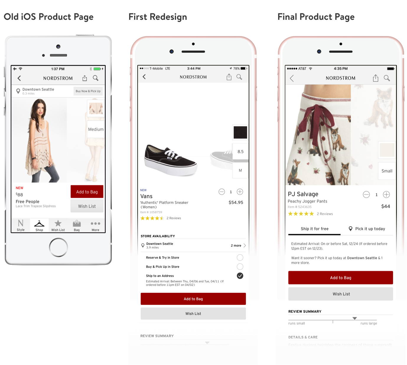
The original product pages
When I inherited the prior product page there were a number of areas for improvement. The page had been designed with only a singular store service in mind, putting a prominent Buy Now & Pick Up button at the top of the page. Not only was this design not scalable to include additional services, usability studies showed that despite it's prioritized "top of the page" location, customers simply skimmed past it, focusing on the product image and missing the control completely. Additionally, an interaction involving a swiping gesture to reveal other stores was not discoverable.
Other problems that needed addressing in a redesign:
- A quantity picker was to be introduced in the near future.
- A review star summary was proven to be effective in purchasing decisions and needed to be promoted higher on the screen.
- Due to a business requirement to keep a list of things above the fold, the area below the product image had become very cramped. Additionally, the above two points threatened to exacerbate this issue even further.
The main reason customers appeared to be failing to discover the original control in usability had to do with order of operations. They consistently first zeroed in on the imagery to evaluate the product, then wanted to pick size/colour, then added to bag. They worked their way down the page.
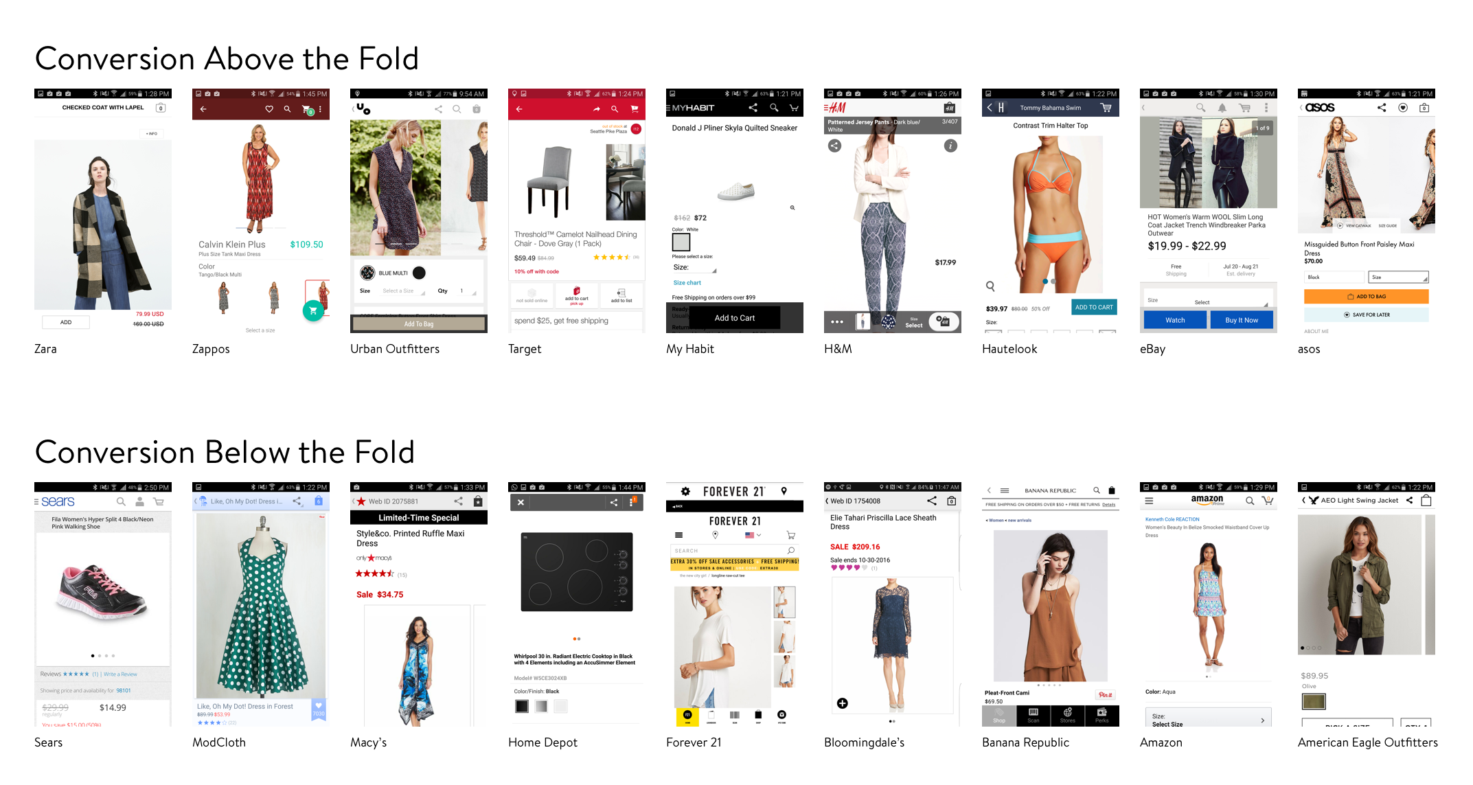
Product page competitive analysis
I conducted a competitive analysis on 18 other retail app product pages and discovered that while half of them maintained an "Add to Bag" type button above the fold, the other half did not. I used these results to convince the business team to let go of the idea of placing the majority of their key components above the fold and to let more content flow down the page.
With the ability to spread out, I was able to order steps in a logical manner as well as let the controls breathe a little.

My first product page redesign
Taking a cue from our usability study results, I aimed to design a product page where the customer would complete their task by flowing down the page with each task dependent on the last, helping the customer construct their purchase as they moved downwards. Product photos, the richest content, were evaluated first, followed by the customer selecting their colour, size and quantity, which then populated all the potential ways a customer could procure the item, including store services, concluding with their commit action.
When the product page redesign initially launched, a 4 week metrics report showed that both standard online purchases and Buy Online & Pick up in Store purchases increased a statistically significant amount, deeming my redesign a success.
After the Reserve & Try in Store service was launched, feedback from customers in usability showed that there was an appetite for a store filtered view of the product page. Customers wanted to be able to see what particular colours and sizes were available in their store as opposed to having to pick a colour/size first to see if that particular combination was in a store.
I kicked off another redesign, one with a goal to clearly set context for shopping a particular store's inventory versus shopping the larger online inventory.

My final product page
My final design organized the customer's purchase options within two tabs that would either filter their product options based on online inventory (Ship it for free) or based on the customer's selected store (Pick it up today).
This update is currently in A/B test on Android and iOS and as of March 2017, it is showing an increase in Buy Online & Pick up in Store purchases. I attribute this to it becoming simpler to find what you want within a particular store.